Responsive Development
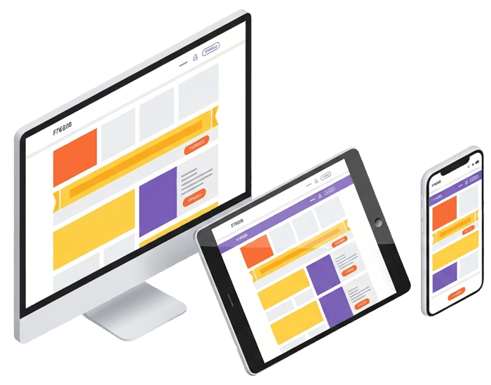
What's included
A flawless experience on every device your visitors use.
Mobile-First Approach
We design and build mobile-first, ensuring the experience is flawless on phones before scaling up.
Cross-Device Consistency
Pixel-perfect layouts across desktops, laptops, tablets, and all smartphone screen sizes.
Fluid & Flexible Layouts
Fluid grids and flexible images that adapt naturally to any viewport without awkward breakpoints.
Touch-Optimized Interactions
Tap targets, swipe gestures, and interactive elements designed for touch screens.
Performance on All Networks
Optimized assets and lazy loading so your site loads fast on mobile networks, not just fast Wi-Fi.
Cross-Browser Testing
Tested across Chrome, Safari, Firefox, and Edge on real devices — not just browser emulators.
Ready to build something extraordinary?
Tell us about your project and let's get started.
OUR PROCESS
Contact US